Moodle Course Formats: A Guide to Presentation and Structure
Moodle course formats are plugins that determine your course page's layout and navigation. Choosing the right format is essential for clarity, and learner engagement.
This guide explains the function and ideal use cases for Moodle's core (bundled) and popular contributed (third-party) course formats. Core options like Topics offer foundational flexibility, while Weekly sets a temporal structure perfect for synchronized semesters. Contributed formats like Edwiser (for modern visual appeal) and Designer (for mixing layouts and complex designs) allow educators to tailor the course experience. By detailing the unique features and best applications of formats like Single Activity, Flexible Sections, and the visually progressive Trail format, this article helps Moodle administrators and teachers select the ideal presentation style to match their pedagogical goals and maximize student success.
Course Formats
A course format is a type of plugin that defines how the main page of a Moodle course is presented: how sections are organised, how navigation works, how content is revealed to learners. When you select a format for a course, Moodle uses that format’s logic to display sections, links, collapsible behavior, menus, and more.
Core (bundled) formats are maintained as part of Moodle itself; contributed (third-party) formats add extra, more visual or structural flexibility.
Core (Bundled) Formats
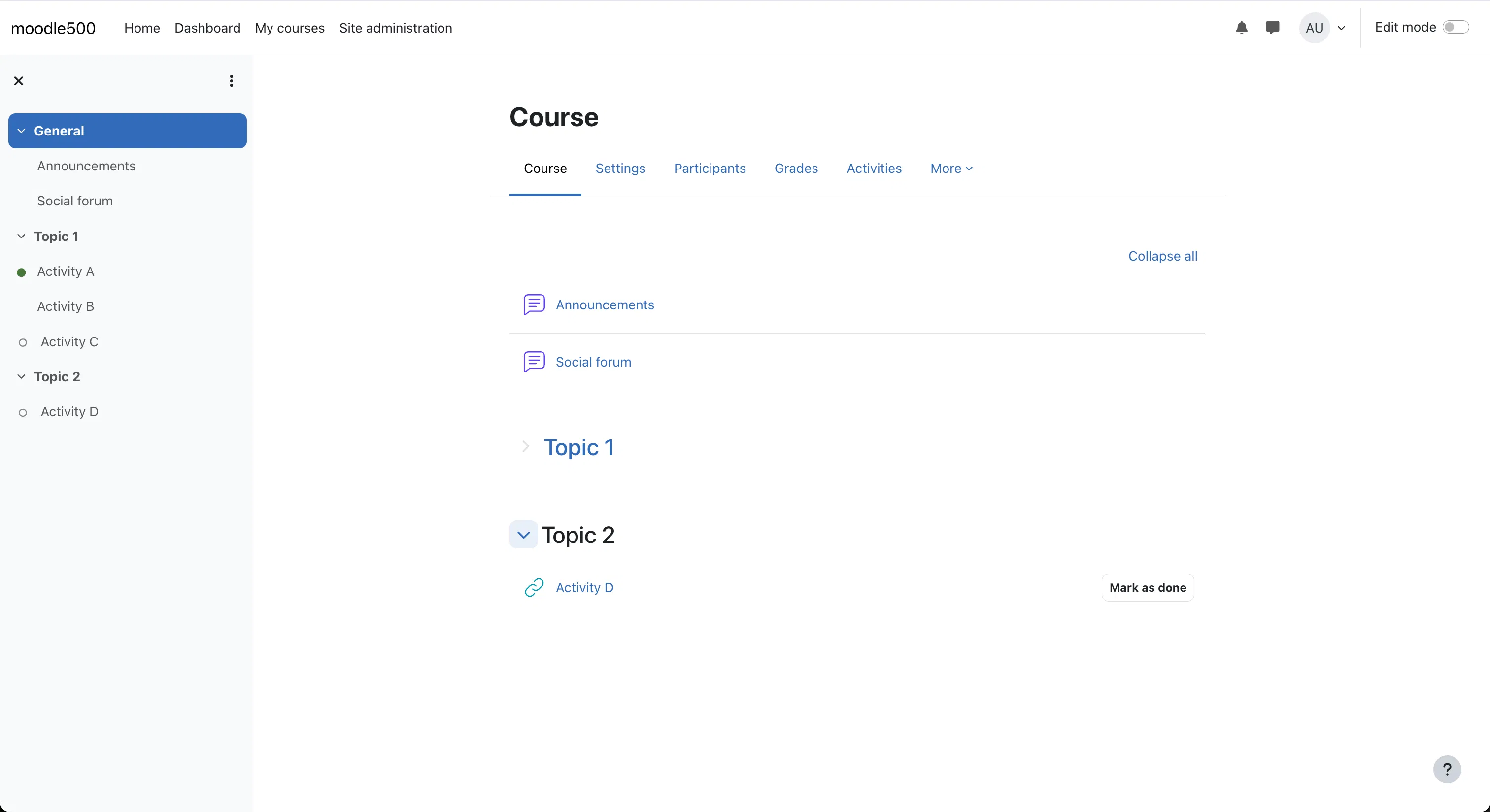
Topics / Custom Sections
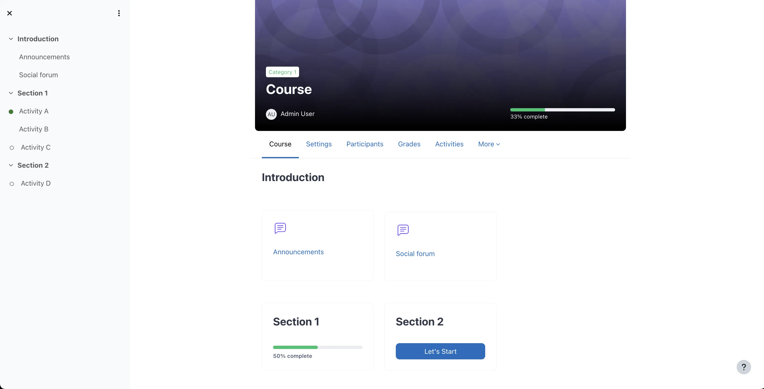
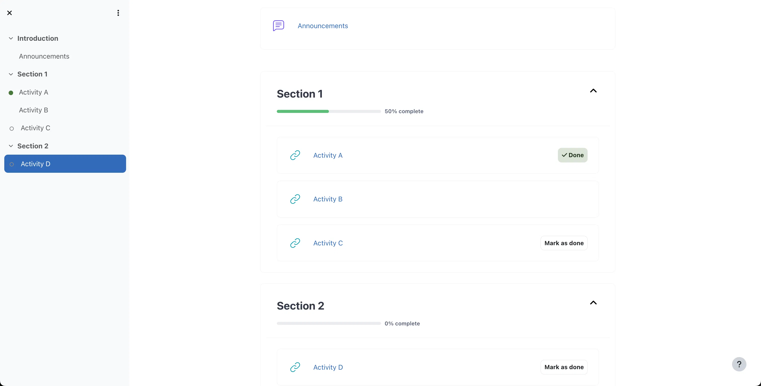
This is one of the most commonly used formats. The course is divided into sections (topics), which you name (for example, “Module 1: Introduction,” “Module 2: Exercises,” etc.). Each section holds resources and activities.
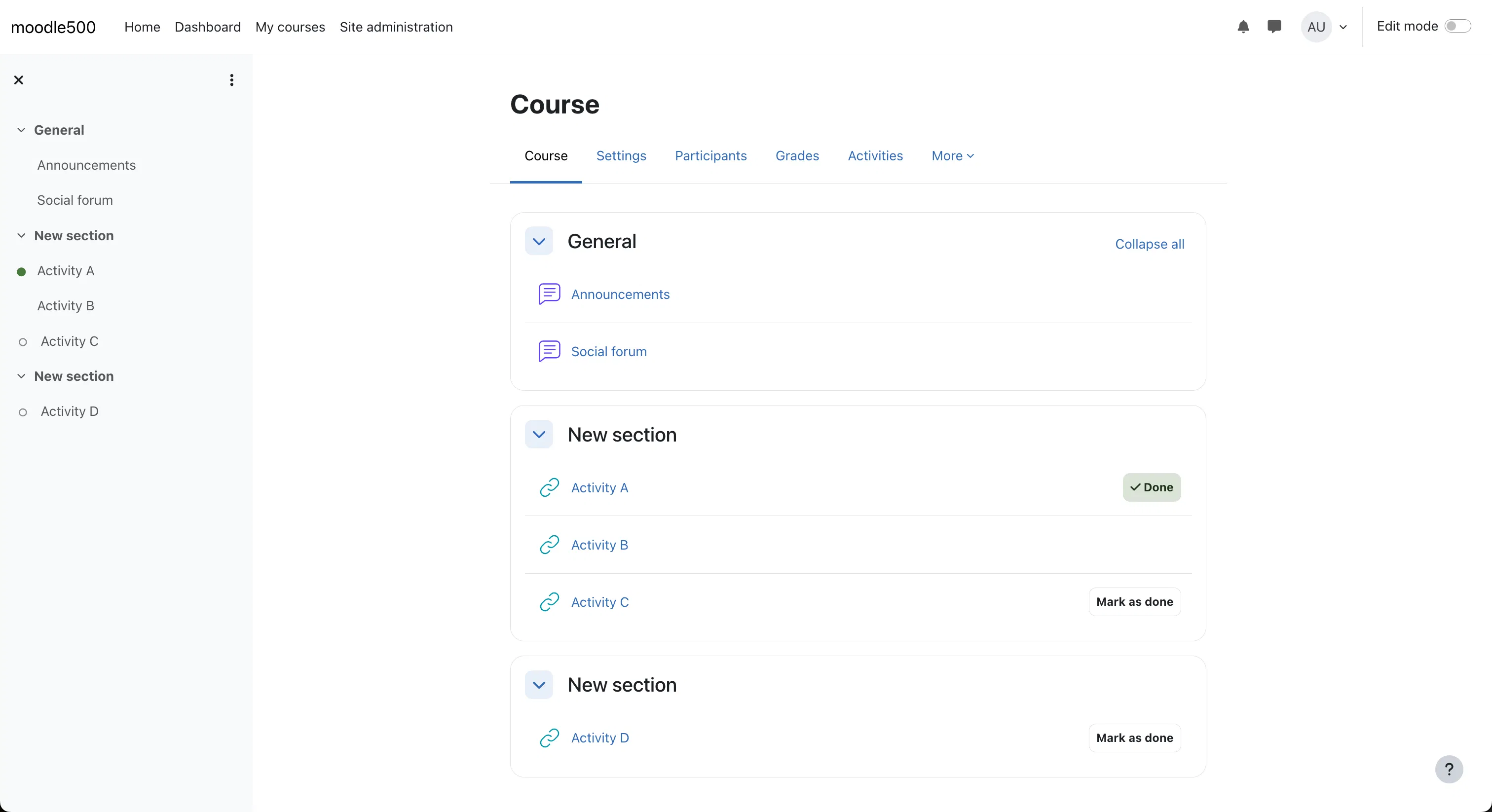
Key options and behavior:
- You can enable “Show one section per page” so learners see only one topic at a time, reducing clutter and helping focus.
- Hidden topics can either be completely invisible to students or shown as placeholders (“not available yet”).
- You can add, remove or rename sections freely.
- In more recent Moodle versions, indentation of activities within a section is possible (visually grouping items).
- Sections can be collapsible (if the theme or settings allow) to reduce overload when there are many topics.
When to use it: Use this format for modular courses that don’t require strict pacing. It offers clarity and structure while giving you flexibility. It's especially good for objective-based or scaffolded learning where students build upon knowledge from earlier topics, and the time required for each module can vary greatly. Because it’s core, it's stable and likely to stay compatible across Moodle upgrades.
Weekly Format
In the Weekly format, each section corresponds to a calendar week (relative to the course’s start date), and Moodle shows date ranges (e.g. “Week 1: August 1 – August 7”). The “current week” is often highlighted to help learners pace themselves.
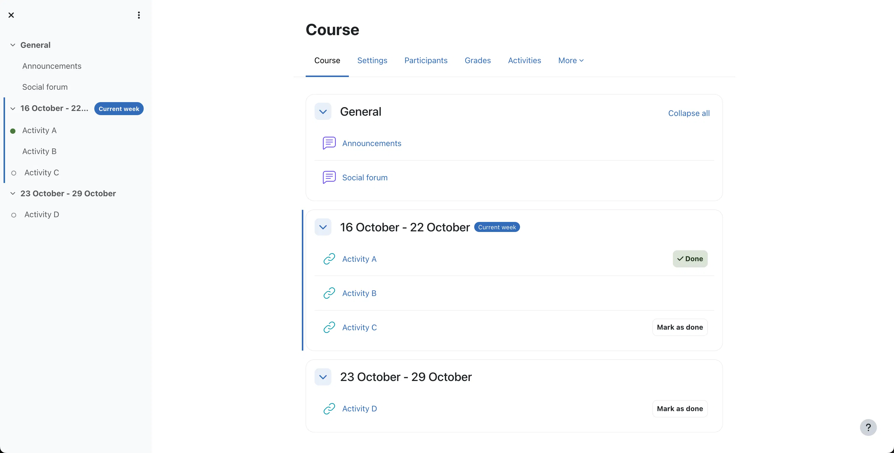
Important details:
- The course start date determines how weeks align; getting that date correct is essential, especially when restoring a course.
- You may combine this with “one section per page” to avoid distracting learners with future weeks.
- Hidden weeks behave like hidden topics (invisible or placeholder).
- On sites that support it, course relative dates may adjust week dates per student enrollment so learners who join later don’t see past weeks as empty.
When to use it: Ideal when your course is time-based, with weekly modules, synchronized deadlines, and a consistent, linear pace, such as traditional face-to-face courses, school or university semesters, or mandatory employee training where all students must complete the material at the same time. It provides a clear temporal structure that helps learners stay on track.
Single Activity Format
This format simplifies the course down to a single activity or resource. Once you choose Single Activity, the entire course page revolves around one chosen module (for example, a quiz, forum, SCORM, or workshop).
How it behaves:
- Only one section (“section 0”) is present; that main activity is front-and-center.
- Navigation is minimal — learners see that core activity first and fewer distractions.
- In newer Moodle versions, an “Additional activities” block may allow extra material (like readings or support documents) to be added without losing the single-focus nature of the main activity.
When to use it: Best for narrowly focused courses, assessments, labs, or when the learning experience centers on one major element. For example, a pre-course survey, a dedicated exam resource, or a course that is simply a single SCORM package. When you want learners to go directly to that centerpiece activity without browsing through many modules.
Social Format
The Social format is designed to center the course around a forum — the discussion becomes the central pivot. However, in newer Moodle versions, Social is disabled by default and is being deprecated. Moodle documentation recommends, instead, using Single Activity (Forum) format and combining it with blocks or links to other content to mimic social behavior.
Because it is no longer the encouraged choice, many modern Moodle sites avoid using Social. But when active, it invites a community-driven, discussion-first organization, making it suitable for collaborative non-linear learning experiences.
Contributed / Third-Party Formats
These formats are plugins developed by the Moodle community or third parties, offering more creative, visual, or hierarchical layouts than core formats.
Edwiser RemUI Course Format (format_remui)
Edwiser offers a set of enhanced layouts under its Course Formats plugin (often used together with the RemUI theme).
It provides three layout options:
- List layout: A clean, collapsible outline of sections, with either all sections on one page or one section per page. It reduces scrolling and keeps structure clear, similar to an enriched Topics format.
- Card layout: Each section is displayed as a card with title, optional background image, icon, and completion indicator. Learners click a card to view contents. This is a very popular, visual-first layout that makes the course page look clean, modern, and engaging.
- Video layout (add-on): Prioritises video content. It presents a large video player at the forefront, with a collapsible “next up” sidebar playlist of upcoming modules. Designed for video-first courses.
Other options:
- You can hide the general section (section 0) when it has no activities.
- You choose layout (card or list) in the course’s Format settings after selecting the plugin.
- It supports themes like Boost, Fordson, Moove, Handlebar, and RemUI itself.
When to use it: Edwiser formats are useful when you need a more polished, visual, and modern presentation. The Card layout is a really good default for an excellent user experience, especially for self-paced or marketing-focused courses where the visual appeal is key. The Video layout is perfect for tutorial series, online lectures, or MOOCs centered around continuous video content consumption.
Be cautious about compatibility: Always test on your theme and backup before activating broadly.
Designer Format (format_designer)
Designer is a highly flexible format allowing different display styles within the same course
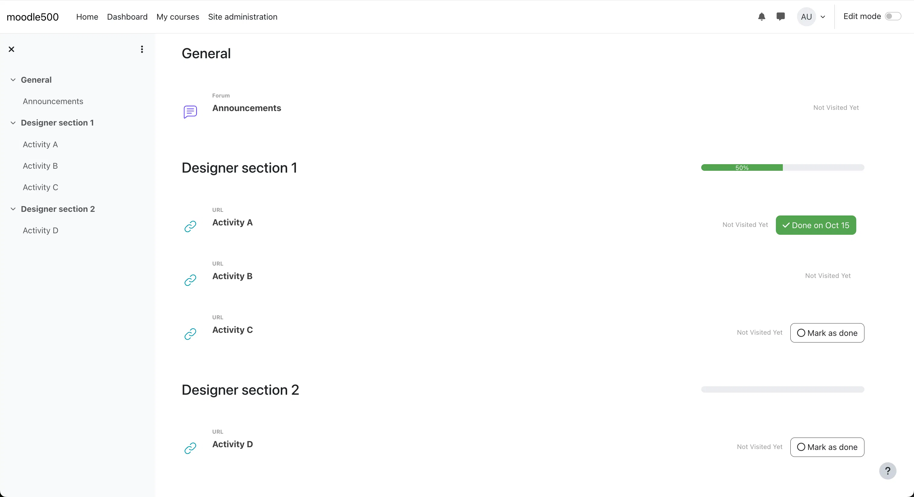
Core features include:
- Multiple display styles per section: You can choose that Section A displays as cards, Section B as lists, Section C as links, all within one course.
- Modes: Designer supports modes like Flow, Kanban, Normal, and Collapsible. For example, Kanban mode lets you present module progress like stages on a board, which is useful for project-based learning or team collaboration.
- Collapsible sections / accordion style: You may configure whether sections collapse or whether only one may be open at a time.
- Layout control: With the Pro version, you can set number of columns for sections, widths/heights, or circular icons.
- Locked / unavailable styling: You can make future or unavailable modules greyed out, hidden, or locked with defined visual cues.
Usage: Designer is a good choice if your course content is heterogeneous (e.g. lectures, labs, projects) and you want different visual treatments for different modules or a complex structural design. Because of its flexibility, it can be highly customized with CSS for an even more complex design and fine-tuned for a specific look and feel, making it great for showcasing varied content types elegantly. Test on mobile thoroughly.
Flexible Sections Format (format_flexsections)
Flexible Sections extends the standard Topics format by adding nesting, optional separations, and collapsibility for creating hierarchical content structures.
Key capabilities:
- Nested sections / subsections: You can place sections inside other sections, creating a hierarchy (units > modules > submodules).
- Display options per section: A subsection may either appear inline (on the same page) or be displayed on its own “child” page, with a “Back to parent” link.
- Collapsibility: You can set whether subsections are collapsed by default to reduce clutter.
- Hide behavior: Hiding a parent section hides all nested subsections and their content.
- Navigation index: In many setups, a course index or sidebar shows the nested structure, letting learners drill down.
- Return links: Activity pages can include a “Return to section” link, easing navigation back up.
Usage: Choose Flexible Sections when your course has layered content (units, modules, submodules) or deep, logically structured content. It brings more structure than flat topics without the rigidity of fully modular formats, making it suitable for large corporate training catalogs or in-depth academic subjects. However, users must get used to navigating deeper hierarchies, and on mobile clients the subsections may default to collapse.
Trail Format (format_trail)
Trail format is built upon the Grid format idea but places modules along a visual “trail,” combining linear progression and visuals.
Its attributes include:
- Visual trail layout: Sections appear as grid items that lie along a path or trail, giving a strong sense of journey or progression.
- Background and transparency options: You can adjust the visual styling of grid elements (opacity, background style) to create aesthetic themes.
- Mobile responsiveness: It handles mobile layout adaptively so the trail structure reshapes for different devices.
- Gamification hints: Because the layout suggests movement along a path, it subtly encourages learners to move to the next “step.”
Usage: Ideal when you want learners to feel they’re on a course journey, especially when modules follow a clear, required sequence. It's excellent for child and K12 education or can be used to add gamification to courses by providing a visual map of the learning path with clearly marked milestones. Be careful that the design doesn't confuse learners — always test navigation clarity.